EIE – Effect of Map Discretization on Interpolation Accuracy
Overview
The accuracy of the interpolated results performed by EIE is dependent on the discretization of the map. Specifically, the results will become more accurate as the map’s point density increases. This study uses a simple 2D model to quantify the accuracy of results interpolated from maps with different densities.
Model
A 1 mm x 1 mm rubber 2D plane strain model with two channels is used. The square’s bottom edge is fixed and the top edge is displaced in the x and y directions as shown below. The x displacement corresponds to channel 1 and the y displacement corresponds to channel 2. The working space of the model is defined by the x displacement ranging from 0 mm to 0.8 mm and the y displacement ranging from -0.08 mm to 0.8 mm.
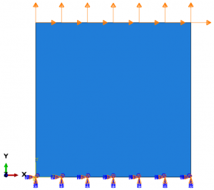
Plane strain model with two channels
The model is meshed with 100 8-node, quadrilateral, plane strain, hybrid, reduced integration elements (shown below).
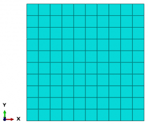
100 element mesh
History
We define as the benchmark reference solution a history that covers the model’s entire working space with a high density of points. An evenly spaced grid of 128×128 points for a total of 16384 points is used as the history (shown below). It is important that this history is more refined than the maps that we will create to ensure that we are testing all regions of our maps.
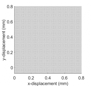
128×128 history points
These points are used to drive the finite element model and the results are recorded. For this study, we record the three non-zero strain components and the hydrostatic pressure (NE11, NE22, NE12, and HP) for each element at each time point. In summary, there are 4 result components, 100 elements, and 16384 time increments. This set of results is the reference solution since it is solved directly by the finite element model. We will compare this solution to our interpolated results to measure our interpolation accuracy.
Maps
Six maps with different levels of refinement are used to compute interpolated results for our history points. All of the maps structure their points as an evenly spaced grid. The first map starts with two points along each edge. With each additional map, the number of points along each edge is doubled so that the sixth and final map has 64 edge points. The map points for the six maps are shown below.
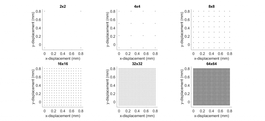
Six maps with increasing levels of refinement
The map points for these six maps are used to drive the finite element model’s two channels. The strain and hydrostatic pressure results from the FEA solutions are recorded at each map point in a similar way to how the results were recorded for the FEA solution that was driven by the history points. Next, EIE is used six times to interpolate the map point results at each resolution onto the high resolution reference history points.
We now have seven sets of history results: the true set of results and six interpolated sets of results.
Results
To compare our results, we look at the absolute difference between the sets of results. The absolute error is used, opposed to a relative error, since some regions of the model’s working space will give near zero strain and hydrostatic pressure. Division by these near zero values would cause the relative error to spike in those regions.
Since we have 100 elements and 4 components per element, there are a lot of results that could be compared. To focus our investigation, we look at the element and component that gave the maximum error. The figure below shows contour plots for each of the six maps for this worst-case element and component. The component that gave the maximum error was NE12. The title of each of the contour plot also shows the maximum error found for each of the plots.
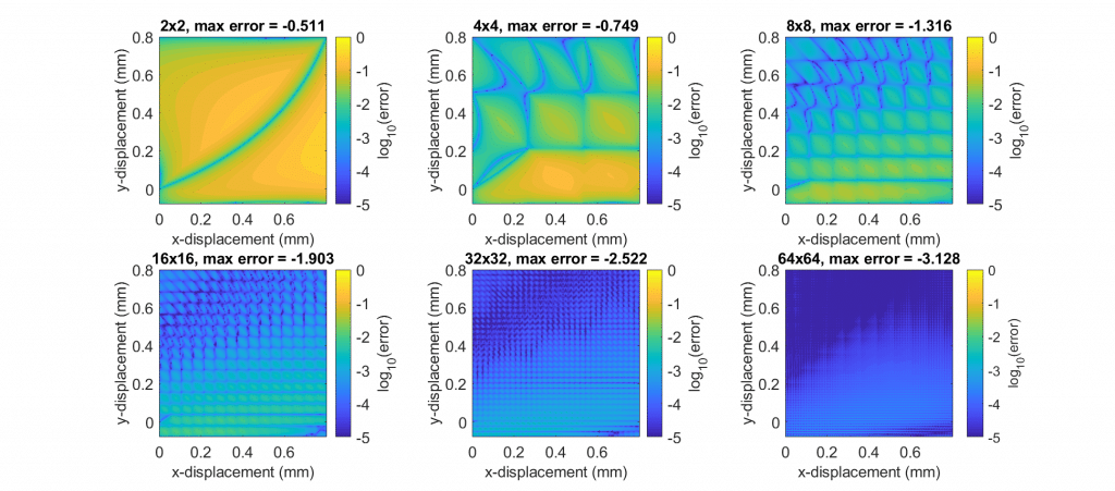
Error contours for the worst-case element and component. Titles report the maximum log10 error.
You can see that the error decreases as the map density increases. Also, you can identify the grid pattern in the contour plots since the error gets smaller near the map points.
Plotting the maximum error for each of the maps against the number of map points on a log scale is shown below. The slope of this line is approximately equal to 1 which is expected since a linear local interpolation was used to compute the results.
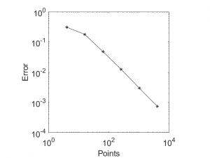
Maximum error vs the number of points for each of the six maps


